
A step by step guide on how to make cool dash boards using python and dask module
Checkout the app dash-health-app.herokuapp and the Github Repo
This post discusses about creating dashboards with real world data to draw insights and take decisions
I wanted to analyze user data collected from Samsung’s Health App and provide interactive plots that allow for data exploration and figures that summarize relevant trends. Any of the modern health app starts by giving insight on the daily activity and then aggreagtes information to give more insights on the patterns which emerge. this is know as Trends Analaysis. It is an important tool not just for end consumer but also in businesses as it helps to assess consumer behavior and often paves way for new solution by drawing insights from the available data.
I had bunch of messy raw files (and yes all of it were ethically sourced) and I decided to do a small project on visualization and web app creation. The analysis was done using the following raw files on sleep, steps, exercise, heart rate etc which are available on my github.
Methodology
The data was very messy and required a lot of preparation to fraw insights. The problem was more complex since the project dealt with time transformation. A part of data required transforming timestamp to date while other required manipulation based on UTC timezone. A large task was also to deal with missing values and data imputations.
Project Structure: The project outline was first done on Jupyter Notebook using pandas, numpy, datetime, matplotlib and seaborn packages. The second part involved translating selected graphs and info into interactive plots using plotly and dash package. The last part involved deploying the project as a web app.
About Samsung Health Data: The data has been taken from a samsung user. The provided datasets would come under 3 classes defined by Samsung (here):
- Activity: step_count, exercise,
- Rest: sleep
- Health Care: heart_rate, stress
Time is a common feature in all the data following is the crucial information for data preprocessing
Trend Analysis
Prepare the data for advanced statistical graphs to signify the trends and patterns using:
i. Weekly Trends
ii. Histograms
iii. Box plots
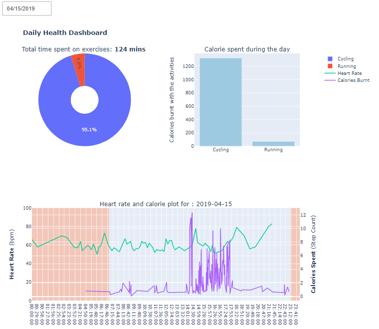
Daily Analysis
i. Preparing a daily profile of the user using - step count, heart rate and sleep data The daily dashboard required advance operations on data joining, grouping and wrangling.
Creating a Dash App
While learning Dash one line that would come across a lot was:
“Dash app code is declarative and reactive”
It took me some time to understand that what it actually means is that we could focus on what is to be displayed and dash library would do the complicated work of how to do it. So important part for me was to structure my project. I visualized that in my app there should be 3 tabs one which talks about project, second which displays daily dash board and third which talks about trends.
das_app/
|--main.py
|--tabs/
|   |intro tab
|   |daily dashboard tab
|   |trends tab
|--src/
|   |preprocess.py
|   |utils.py
|--assets/
|--datasets/
|   |*.csv
Step I. Coding Methods for creating Graphs on Plotly
After cleaning the data, I started with creating simple graph from plotyly using plotly express module.
import pandas as pd
import plotly.express as px
sleep = pd.read_csv('sleep.csv')
fig = px.bar(x=list(sleep.groupby(['hours']).mean().unstack()['duration'].index), y=list(df.groupby(['hours']).mean().unstack()['duration'].values))
Which is a simple bar graph with x-axis as hour of day and y axis as average duration of sleep. Since this would show me what is the usual wake up time and how much does this individual actually sleep. I would next create a function which could take the input for dataframe, x-axis column and y-axis column. Something like below:
def bar_plot(attribute):
  if attribute == 'sleep':
    df = sleep_df
    xaxis = "waking_hour"
    vals = "sleep_duration"
  elif attribute == 'exercise'
    df = exercise_df
    xaxis = "exercise_type"
    vals= "calorie"
    ...
    ...
  fig = px.bar(x=list(df.groupby([xaxis]).mean().unstack()[vals].index), y=list(df.groupby([xaxis]).mean().unstack()[vals].values)
  return fig
Similarly, I created different graphs by defining them as functions. And i saved these functions inside src folderwhich is to contain source files for visualization in your app.
II. Creating App Layout
Modular Coding: When I started, I had much trouble in debugging the codes. The dash library has Python abstraction for HTML and I would inadverently get much lost in ‘html.Div’ one bracket here and there and I had to sepnd time looking for missing piece! To declutter the codes a best practice is to modularize the pieces. A very basic dash app is just presenting a markdown text.
# import dash libraries
import dash
import dash_html_components as html
import dash_core_components as dcc

# ready the app to be served
external_stylesheets = ['https://codepen.io/chriddyp/pen/bWLwgP.css']
app = dash.Dash(__name__, external_stylesheets=external_stylesheets)
app.config['suppress_callback_exceptions'] = True
app.scripts.config.serve_locally = True
server = app.server

# write markdown text
intro_text="""
#### Background
Aim of the project is to..."""
# define the app layout
app.layout = html.Div([
  dcc.Markdown(children=intro_text)
])

if __name__ == '__main__':
    app.run_server(debug=True)
When the above python file runs on terminal it would create a local server to display the markdown text on a port 8050 by default. I created markdown file for introduction and the copied complete codes as a seperate itron_tab.py.In similar way to display the graphs dcc.Graph components are called. Thus in end I had one directory with lay outs for each tab and one directory which defined each graph. And my main file - app.py had to just import the files from these created libraries.
III. Deploying as a Web App on Heroku
Final part included deploying the app on Heroku. Which is very simple if one is hands on with git. Heroku allows us to create a free account to hose web apps. Since the web app was ready I created a new directory and copied all the files to it. Next I created a virtual environment using virtualenv module. Next I creates requirements.txt which had all the modules which were called in the dash app. A file that is needed for deploying an app on Heroku is Procfile. Which has basic contents:
web: gunicorn healthapp:server --log-file=-
I found a video by charming data very well structured and simple.
So, pushing and pulling a file from Heroku is similar to Github where the remote is defined as Heroku instead of Origin.
Let me know your thoughts on the article hope you would have liked it..